Designing a domain search for non-technical, first-time buyers required simplifying the process and reducing complexity. We focused on user needs to create an easy, intuitive search that led users quickly to their desired domains.
Project Overview
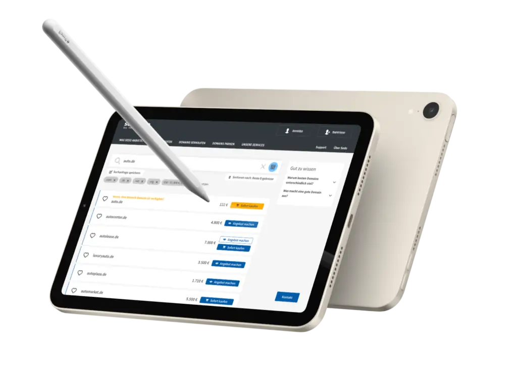
We redesigned the search functionality for domain buyers, focusing on simplifying the process for first-time users. Domains, especially those on the secondary market, are a somewhat abstract product and can be complex to navigate. However, analytics revealed that most buyers were non-professionals—users with a specific domain or category in mind for personal or business purposes.
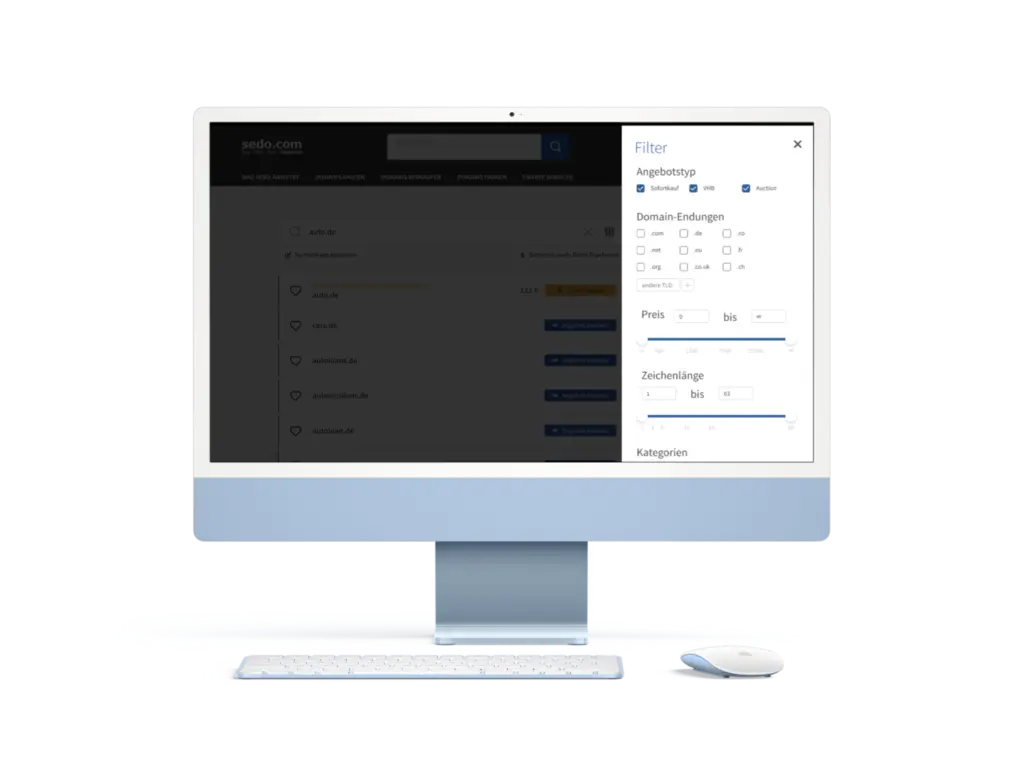
Filters - easy to use but not a distraction.
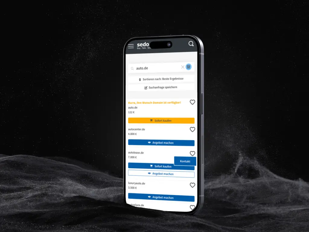
Mobile view (the "Kontakt" - button is floating).
Design Strategy
Our goal was to make the search process as intuitive as possible:
Reduced complexity: We simplified the interface by minimizing metadata and moving advanced filters off-screen to reduce unnecessary decision-making.
Transparent search experience: Users could see how many results their search yielded, along with tips to adjust queries if too many or too few results appeared.
Clear filter design: We displayed active filters visually, so users understood how they were refining their search.
User Engagement
To better align with user needs, we conducted interviews at fairs with both users and stakeholders. Their feedback was crucial in refining the search, allowing us to improve clarity and usability while also supporting our business goals.
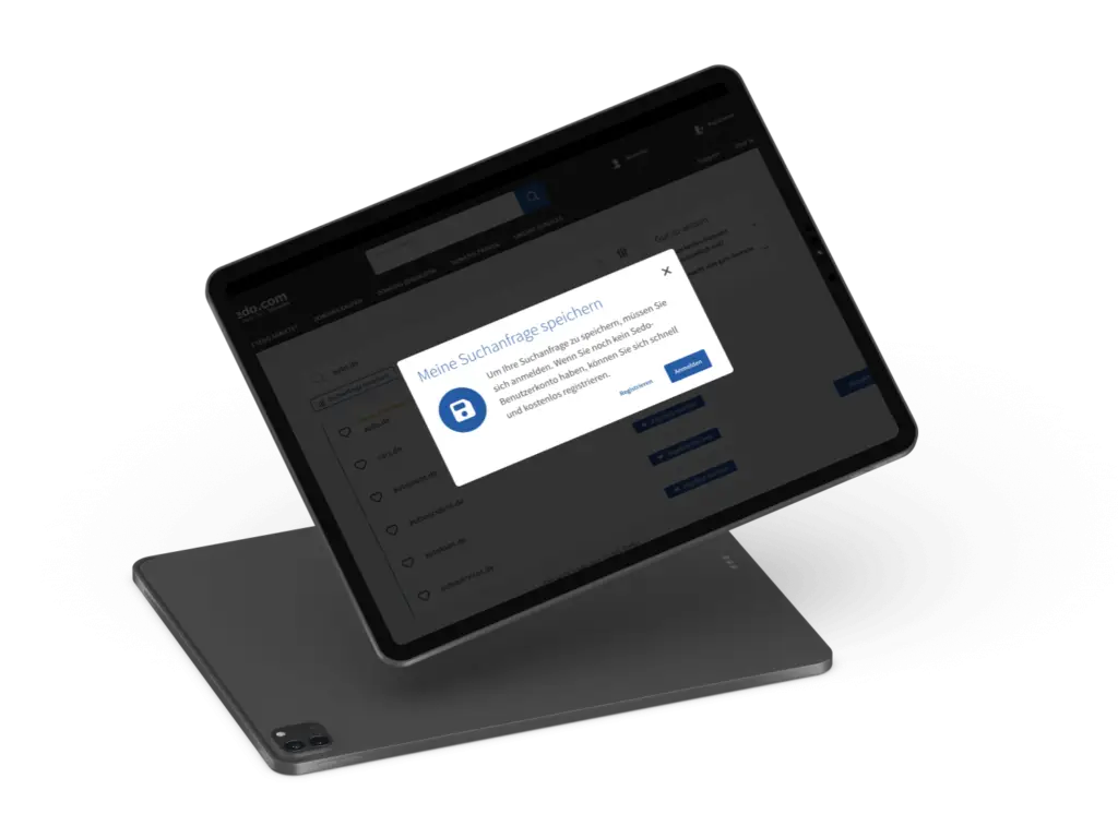
Save this search - a feature that gives users ease and us insights into users preferences and behaviour.
Results & Rollback
Despite a suboptimal rollout plan that required a quick rollback, initial feedback and user engagement were promising. Users easily understood interface elements like filters and purchasing options, showing the design’s effectiveness in simplifying the search process.